FinFlow

2025

Improved retention with an actionable dashboard for businesses

I joined a fintech company where our clients struggled to make sense of their financial data. The product mainly reported transactions, so business owners created their own spreadsheets to analyse results. This led to repeated support requests and high churn. It became clear they didn’t need more data, but a clearer way to see it. That insight sparked the idea for creating an actionable dashboard for businesses.

I joined a fintech company where our clients struggled to make sense of their financial data. The product mainly reported transactions, so business owners created their own spreadsheets to analyse results. This led to repeated support requests and high churn. It became clear they didn’t need more data, but a clearer way to see it. That insight sparked the idea for creating an actionable dashboard for businesses.

Role

Product Designer

Sole Designer

Team

1x Product Manager

2x Engineers

Impact

Faster financial decisions for small businesses

Helped product team validate product-market fit

Actionable dashboard improved client retention

Fewer support tickets after launch

Role

Product Designer

Sole Designer

Team

1x Product Manager

2x Engineers

Impact

Faster financial decisions for small businesses

Helped product team validate product-market fit

Actionable dashboard improved client retention

Fewer support tickets after launch

Role

Product Designer

Sole Designer

Team

1x Product Manager

2x Engineers

Impact

Faster financial decisions for small businesses

Helped product team validate product-market fit

Actionable dashboard improved client retention

Fewer support tickets after launch

Problem area

Small teams, big data chaos

Small businesses were drowning in data scattered across tools and spreadsheets. Without clear insights, they made slow and reactive decisions that led to costs and misses opportunities. For us, it led to support to tickets, low adoption, and clients losing trust in the product.

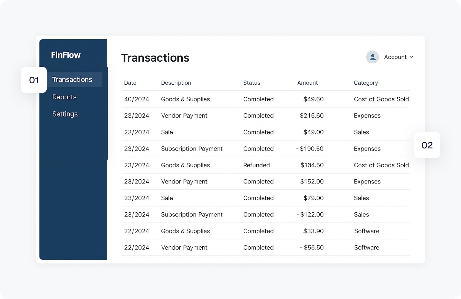
Product before redesign

Opportunity 1

Introduce data-driven guidance to reduce confusion and support tickets, helping businesses make decisions faster and stay engaged.

Opportunity 1

Introduce data-driven guidance to reduce confusion and support tickets, helping businesses make decisions faster and stay engaged.

Opportunity 1

Introduce data-driven guidance to reduce confusion and support tickets, helping businesses make decisions faster and stay engaged.

Opportunity 2

Transform static transaction data into clear insights, making it easier to act and improving retention.

Opportunity 2

Transform static transaction data into clear insights, making it easier to act and improving retention.

Opportunity 2

Transform static transaction data into clear insights, making it easier to act and improving retention.

Design goals

What I aimed to achieve

Simplify decisions

Turn complex data into clear, actionable insights that drive business decisions.

Simplify decisions

Turn complex data into clear, actionable insights that drive business decisions.

Simplify decisions

Turn complex data into clear, actionable insights that drive business decisions.

Build trust

Design a clear, reliable dashboard that keeps business owners in control.

Build trust

Design a clear, reliable dashboard that keeps business owners in control.

Build trust

Design a clear, reliable dashboard that keeps business owners in control.

Drive adoption

Add a test space so business owners explore freely, see wins, and stay engaged.

Drive adoption

Add a test space so business owners explore freely, see wins, and stay engaged.

Drive adoption

Add a test space so business owners explore freely, see wins, and stay engaged.

Design decision 01

Defining KPIs that actually matter

Early interviews showed small business owners care about staying profitable, not vanity metrics. I focused the dashboard on cash flow, overdue invoices and growth. It meant trading depth for clarity, but it helped surface quicker insights that could drive better decisions and improve retention.
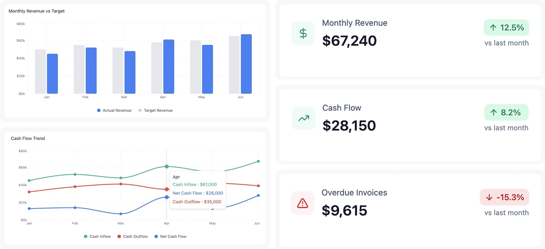
Top KPIs selected

Monthly revenue

Tracks business growth at a glance

Monthly revenue

Tracks business growth at a glance

Monthly revenue

Tracks business growth at a glance

Cash flow trend

Reveals stability and future risks

Cash flow trend

Reveals stability and future risks

Cash flow trend

Reveals stability and future risks

Overdue invoices

Flags delayed payments early

Overdue invoices

Flags delayed payments early

Overdue invoices

Flags delayed payments early

Revenue vs target

Keeps goals visible and measurable

Revenue vs target

Keeps goals visible and measurable

Revenue vs target

Keeps goals visible and measurable

Design decision 02

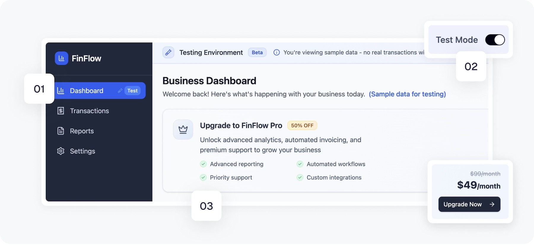
Building trust through a testing mode

Many users dropped off the platform before connecting their data. Instead of forcing onboarding, I introduced a sandbox mode so they could explore the product right away. It lowered the barrier to entry and helped them understand the value before committing.

1. Testing mode indicator

It reassures business owners they can explore the feature safely without being charged.

1. Testing mode indicator

It reassures business owners they can explore the feature safely without being charged.

1. Testing mode indicator

It reassures business owners they can explore the feature safely without being charged.

2. Context message

It reduces business owners anxiety about their real data being used in the feature demo.

2. Context message

It reduces business owners anxiety about their real data being used in the feature demo.

2. Context message

It reduces business owners anxiety about their real data being used in the feature demo.

3. Upgrade banner

It encourages business owners to activate the full version by giving a clear offer breakdown.

3. Upgrade banner

It encourages business owners to activate the full version by giving a clear offer breakdown.

3. Upgrade banner

It encourages business owners to activate the full version by giving a clear offer breakdown.

Design decision 03

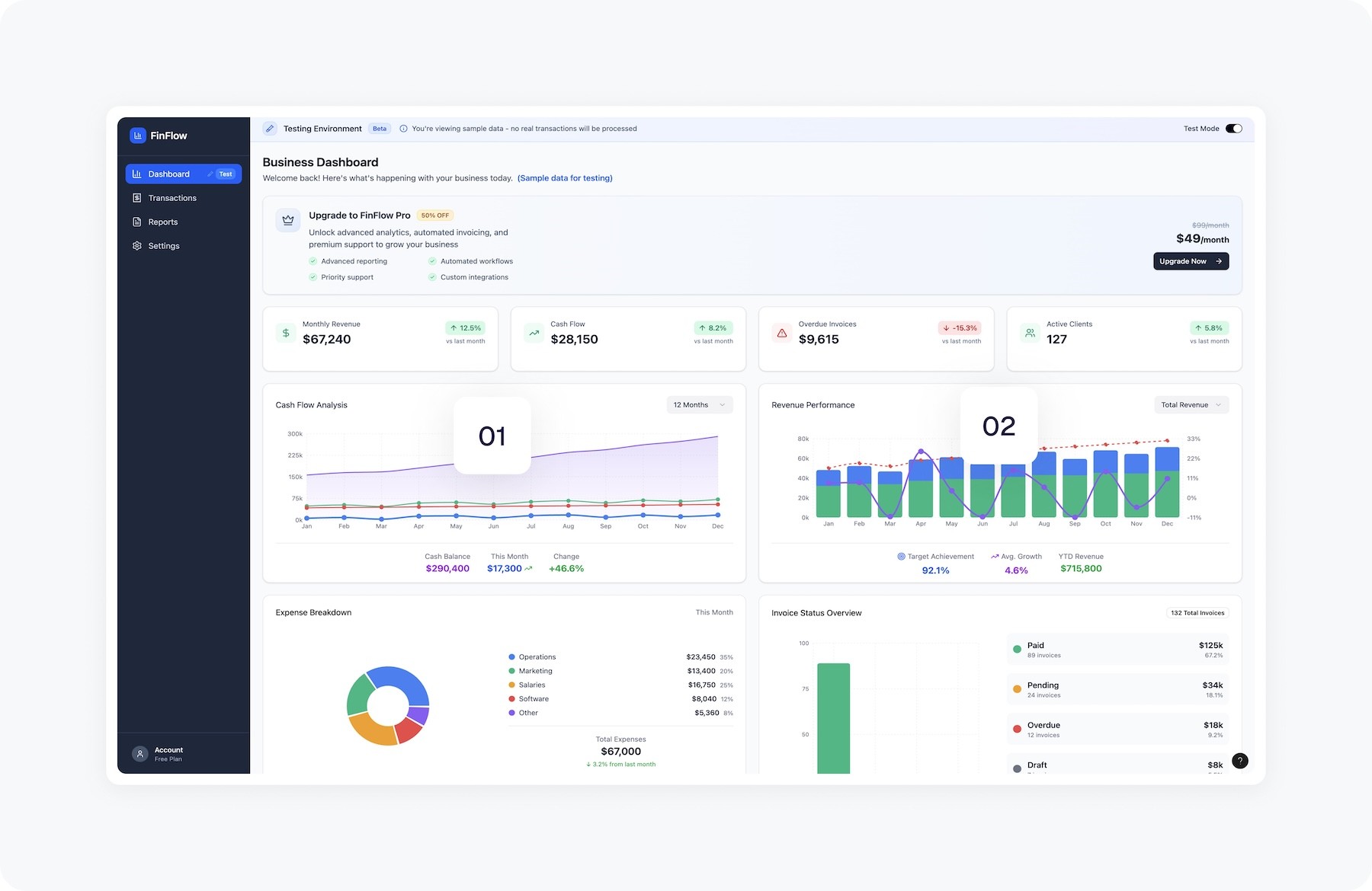
Choosing clarity over complexity in visualisation

I explored two directions: a chart-rich layout and a minimalist one. I went for simplicity because financial data needs precision and quick scanning. The clean layout made key insights easier to understand and improved trust in the tool, especially important at a time when customers were resigning and product retention was decreasing.

Version 01: What I learned testing with business owners: charts were too complex

Learning 01

Unclear priorities: Competing data made it hard for business owners to see what mattered

Learning 01

Unclear priorities: Competing data made it hard for business owners to see what mattered

Learning 01

Unclear priorities: Competing data made it hard for business owners to see what mattered

Learning 02

Too much noise: charts were hard to read, slowing decisions when businesses needed speed.

Learning 02

Too much noise: charts were hard to read, slowing decisions when businesses needed speed.

Learning 02

Too much noise: charts were hard to read, slowing decisions when businesses needed speed.

Retrospective

Designing for confidence, not data literacy

Before and After redesign

Impact

Empowered businesses

Business owners gained control, tracking performance in minutes and deciding faster.

Empowered businesses

Business owners gained control, tracking performance in minutes and deciding faster.

Empowered businesses

Business owners gained control, tracking performance in minutes and deciding faster.

Increased retention

Dashboard became central, engagement rose, and support tickets fell significantly.

Increased retention

Dashboard became central, engagement rose, and support tickets fell significantly.

Increased retention

Dashboard became central, engagement rose, and support tickets fell significantly.

Increased efficiency

It cut design time from weeks to days, letting the team test, refine, and deliver faster.

Increased efficiency

It cut design time from weeks to days, letting the team test, refine, and deliver faster.

Increased efficiency

It cut design time from weeks to days, letting the team test, refine, and deliver faster.

Create a free website with Framer, the website builder loved by startups, designers and agencies.