Super Bank
2024
What if business banking was as easy as sending a message?
Small business owners relied on our mobile app to manage cash flow on the go. But simple actions, like sending money or approving invoices, took six steps, two confirmation screens, and often ended in error. This led to retention issues and an overloaded our support team.
How improving the full transfer flow cut support tickets by 42%
Instead of fixing single screens, I mapped the entire transfer flow to find where business users got stuck and reached out for help. Most issues happened mid-transfer or right after sending. The goal was to rebuild trust and give business owners back their time by improving the completion rate of payment flows.
Problem area
When product friction became a retention problem
Small businesses were drowning in data scattered across tools and spreadsheets. Without clear insights, they made slow and reactive decisions that led to costs and misses opportunities. For us, it led to support to tickets, low adoption, and clients losing trust in the product.
When product friction became a retention problem
Design decision 01
Speeding up payments to reduce drop-offs
Most drop-offs happened mid-payment when business users had to reselect accounts and confirm twice. I combined those steps into one clear summary with smart defaults and live balances to speed this up for users and lighten our support team.
Selecting account and recipient
Design decision 02
Reducing errors with smarter confirmations
Business users often sent or approved payments in a hurry. The confirmation page missed key details they didn’t always check, leading to errors and rework. I redesigned it to clearly show account, amount, and recipient, and added a final double-check screen to save time and prevent costly mistakes.
Confirming and reviewing transfer
Design decision 03
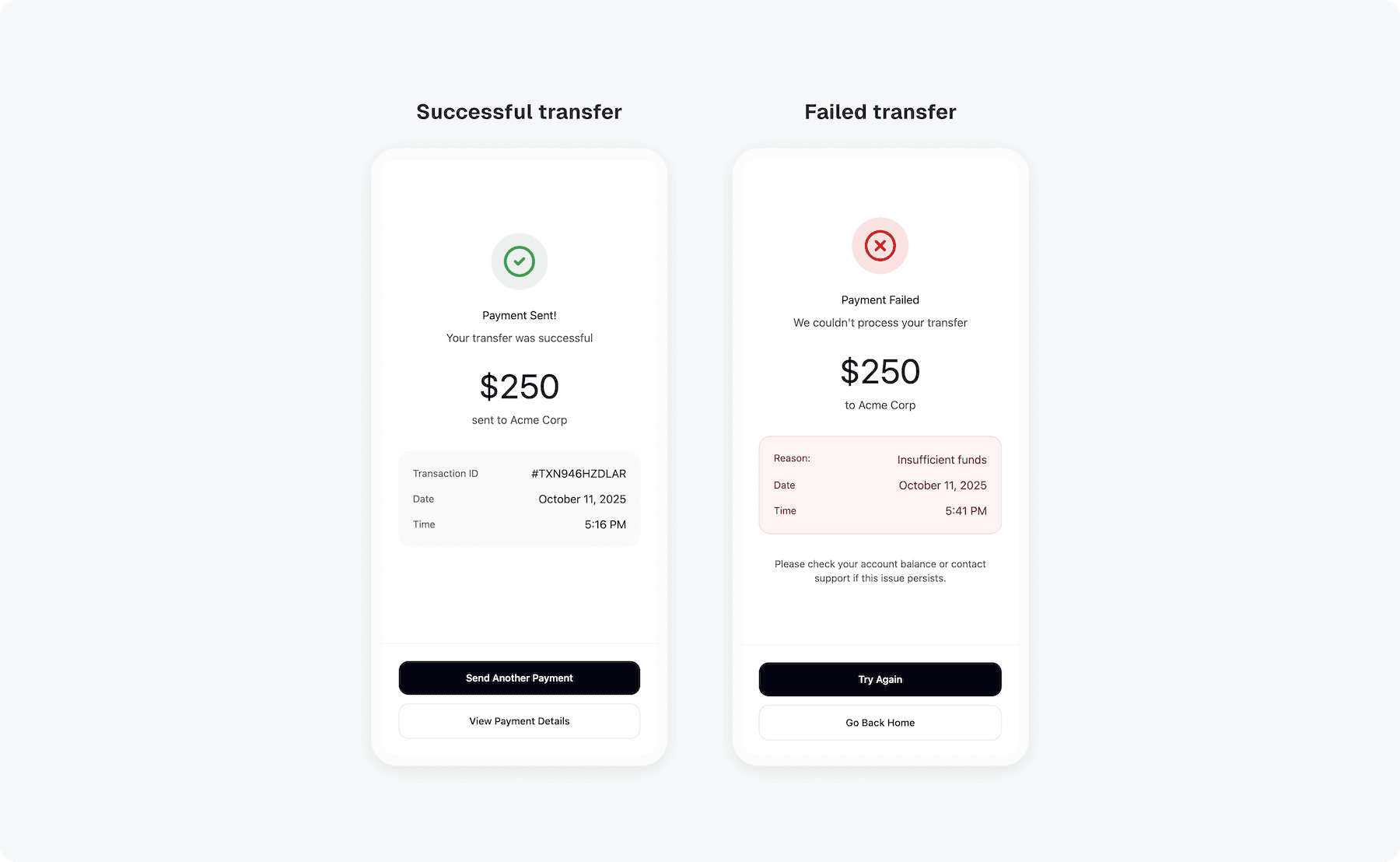
Making transfer status clear after sending
After sending a transfer, business users weren’t sure if it went through or failed. The feedback came too late, creating anxiety and extra support tickets. I introduced instant success and error states with clear next steps, helping users feel confident their money was sent.
Confirmation screen
Retrospective
Increased transfer completion by 32%
Business owners spent less time managing transfer and felt more confident using mobile banking on the go. The new flow became one of the main reasons users upgraded to premium plans.